
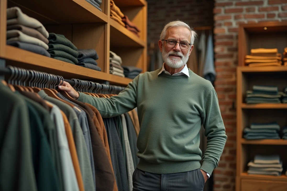
After 60, the skin loses its natural contrast: hair grays, eyebrows thin out, and the complexion may slightly yellow. These changes alter how a clothing color interacts with the face. Choosing clothing colors after 60 is not about a fixed aesthetic code, but rather a measurable optical adjustment related to skin tone, fabric brightness, and even vision.
Loss of skin contrast and colorimetry: what changes concretely after 60
Classic colorimetry classifies individuals into seasons (spring, summer, autumn, winter) based on the contrast between skin, hair, and eyes. This diagnosis, often made between the ages of 30 and 50, can become outdated a decade later.
Further reading : Decorating with Plants: How to Choose and Where to Place Them
Since 2024, several colorists and makeover schools in France have adapted their diagnostics for mature skin. The École Supérieure de Relooking (Paris) has dedicated a professional cycle to this topic, summarized in the magazine Les Nouvelles Esthétiques (n° 771, October 2024). The main finding: a person diagnosed as “winter” at 40 may shift towards softer recommendations as natural contrast decreases.
Finding tips for choosing clothing colors after 60 that are adapted to this evolution requires starting from an updated diagnosis, not generic recipes.
See also : How to maintain your air cooler?
| Skin Parameter | Before 60 (average) | After 60 (observed trend) | Impact on color choice |
|---|---|---|---|
| Hair/skin contrast | High to medium | Low (graying, light eyebrows) | Very dark shades near the face harden features |
| Skin undertone | Stable | Shifting towards yellow or pink | Cool pastels can accentuate paleness |
| Natural skin glow | Stronger light reflection | Reduced reflection | Matte fabrics absorb light, satins reflect it |
| Visual perception (wearer) | Full spectrum | Dissaturation related to frequent cataracts | Favor slightly more saturated colors for spatial orientation |
Vision and clothing colors: the factor that fashion ignores
The Société Française d’Ophtalmologie (SFO) has published a patient file titled “Seeing and Living Well After 60.” This document reminds us that cataracts, even in their early stages, filter part of the blue spectrum and desaturate perceived shades. The colors worn appear duller to the wearer themselves.
This information has a direct consequence on clothing choices. Opting for slightly more saturated colors near the face compensates for visual desaturation and makes spatial orientation easier. This recommendation does not come from the fashion world, but from ophthalmology.
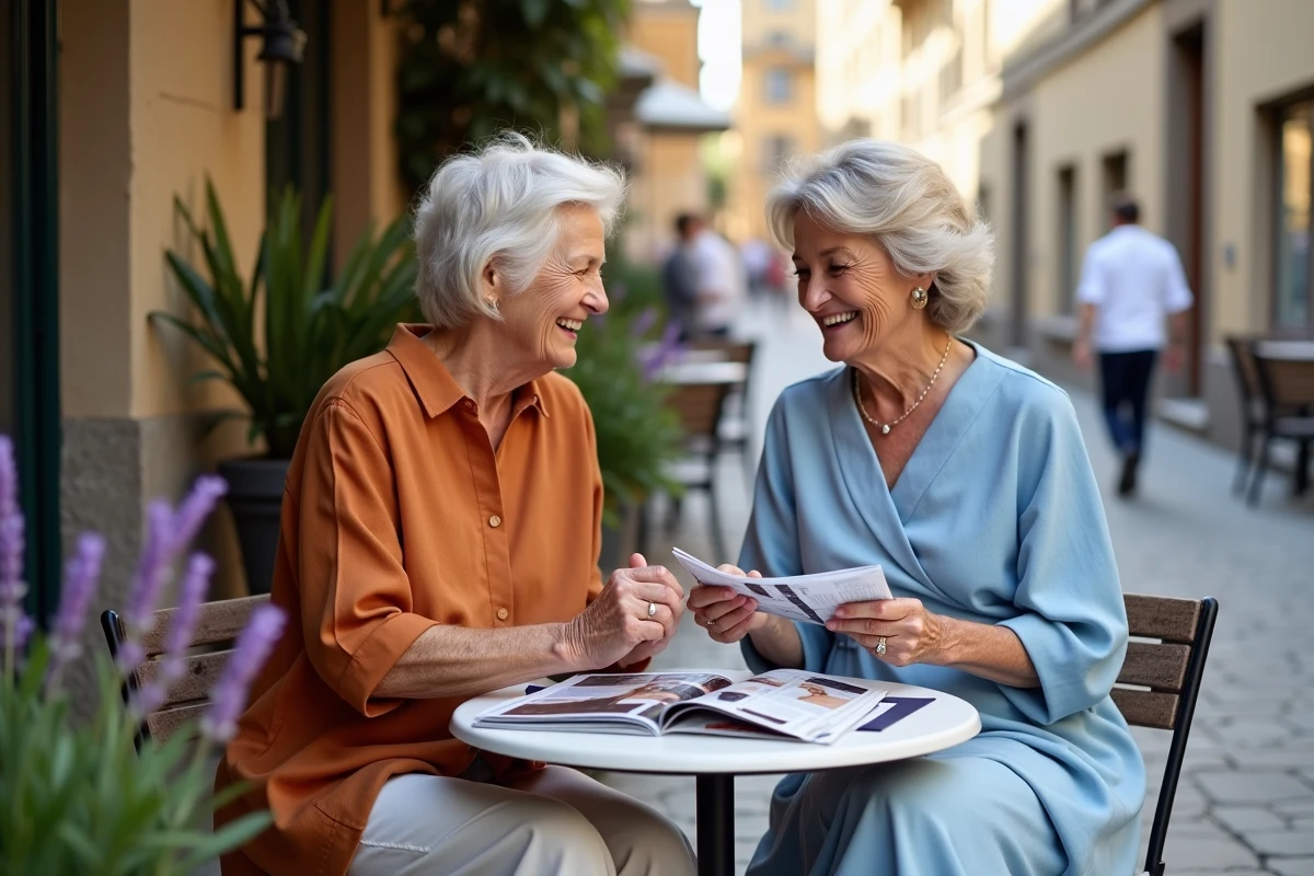
In practice, this does not mean wearing bright red from head to toe. A turtleneck, a light necklace, or a top in a strong shade (deep burgundy, teal, emerald green) is enough to create a visual anchor. The rest of the outfit can remain neutral.
Saturation vs. brightness: two distinct levers
Saturation measures the intensity of a color. Brightness measures its lightness. After 60, slightly increasing saturation without raising brightness often yields the best result: the color remains rich without appearing garish.
Conversely, a very light pastel (high brightness, low saturation) can blend with the complexion and erase the contours of the face. Pure black, on the other hand, creates too harsh a contrast when the natural contrast of the face has diminished.
Flattering colors after 60: test rather than guess
Lists of “colors to wear” and “colors to avoid” circulate on all fashion blogs. Their limitation: they ignore individual variability. A woman with olive skin and salt-and-pepper hair will not react to the same shades as a woman with very fair skin and white hair.
Rather than a universal list, three concrete criteria allow for effective sorting:
- The fabric test near the face: hold the garment under the chin, facing natural light. If the complexion appears more even and the eyes brighter, the color works. If dark circles or redness stand out, move on to another shade.
- The warm/cool distinction of the undertone: a warm undertone (golden, peach) pairs better with terracotta, khakis, and rusts. A cool undertone (pink, bluish) harmonizes with plums, navy blues, and slate grays.
- The role of the fabric itself: a matte cotton and a satin in the same color do not produce the same effect. Slightly shiny or satin fabrics reflect more light back to the face, which can compensate for the loss of skin glow.
The question of black
Black remains omnipresent in wardrobes. After 60, it continues to work on the lower silhouette (pants, skirts) or as a jacket. However, a black collar without a color break near the face accentuates shadows and can deepen features. Interspersing a cream turtleneck, a light necklace, or a colorful scarf between the black and the face is enough to restore balance.
Renewing your wardrobe without changing everything: a zone-based method
Replacing an entire wardrobe makes no sense. The area that matters most for color impact is between the shoulders and the chin. This is where the fabric interacts directly with the complexion.
- Upper zone (tops, collars, scarves, jewelry): this is the area of maximum impact. Concentrate the most flattering colors here.
- Middle zone (jackets, belts): neutrals work well, with a reminder of the upper color if needed.
- Lower zone (pants, skirts, shoes): color has little influence on the face here. Comfort, fit, and style take precedence.
This zone-based approach allows for renewing two or three upper pieces each season rather than rethinking the entire wardrobe. A limited investment for a visible effect.
The choice of clothing colors after 60 is based on measurable physiological parameters, not on style conventions. An updated colorimetry diagnosis, a simple test in natural light, and particular attention to the upper zone of the silhouette cover most situations. The rest is a matter of personal taste, and taste has no age.